
Animations can enhance or detract from your site’s experience. Here are some tips to use them well.

Animating images with Squarespace is easy, here are three basic animation tenets to make sure they enhance your site.
Make it feel natural.
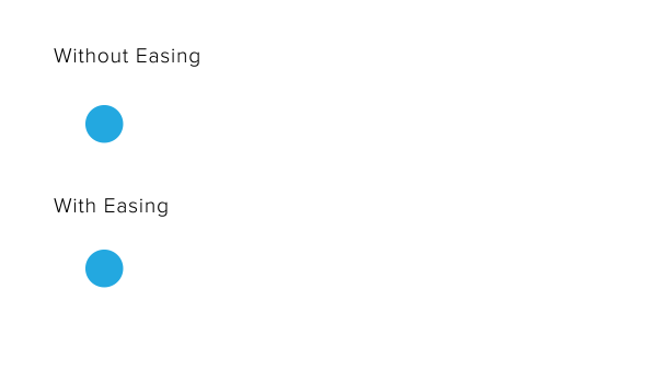
We want to avoid making animations seem robotic. If you think about how humans, cars, trains, everything really, move, it’s never just a 0-60, so to speak. We ease into our movements. Notice when sprinters are preparing to run, they take a step backwards first to rev up. When your car starts rolling, it has to speed up over time. A train doesn’t just stop on a dime when it pulls into the station or we’d all go flying out of our seats! We need to ease into and out of motion. Using eases on your animations will make them feel more natural as well.
Subtlety is key.
This one should be pretty obvious, but when using animation on your site, you want to be a little subtle with it. Overwhelming the page with animations can be just that: overwhelming! It’s hard to tell what to focus on when there’s a lot of movement at once. Focus on the elements that should draw the users attention, and stick to animating those.
Within that, it’s also best to keep those animations minimal as well. Making your images bounce all over before settling down can be kinda fun, but actually really obnoxious and distracting to someone trying to read your content. It’s best to keep your animations really simple. And with that, make sure they…
Enhance the story.
Your animations should relate somehow to the rest of the page (and at the very least, not detract from the content). Here’s an example: an older version of this site showed illustrations that animated in as you scrolled down the page.
How do they animate? Well, if the content is to the right of the image, the image animates in from the left, thereby adding itself to the content. If I were to animate the image in the other direction, from the right, it would look like it’s leaving the content instead. If I animated it from the top, that wouldn’t detract from the story, but it wouldn’t be enhancing it either.
Similarly, on the home page of the site, I am animating the illustrations describing my services from the right and left to add them to their content, but in the pricing section, I’m animating from the top to both lead them into their content and help direct the viewer down the page.
Animating In Squarespace
I hope these tips help you better use animations on your website! You can easily animate your images with Squarespace under Edit > Animation. Choose which type of animation you’d like, or choose Custom to get even more options. Just remember to use them wisely!
Happy animating!